Monitoring RED Metrics in Production
April 27, 2026
Tags:
Observability
.png)
Imagine this: Your order service just got flagged by a customer. Checkout is failing. You pull up your dashboards and see that the CPU is at 40%, memory is stable, all pods are running. Everything looks fine. But requests are failing, and users are experiencing it in real time.
That's the blind spot infrastructure metrics can't cover on their own. CPU and memory tell you how your system is consuming resources, and that matters. But they don't tell you whether your users are getting a response, whether that response was correct, or how long it took. A service can be well within its resource limits and still be silently failing the people depending on it.
RED metrics i.e. Rate, Errors, and Duration, fill that gap. In this post, we'll walk through why RED metrics matter, what to watch for in each signal, how to collect them using OpenTelemetry, and how to turn that visibility into active monitoring so you know about problems before your users do.
When something breaks in production, most teams open their infrastructure dashboards first.
CPU, memory, pod restarts, these are the default signals, and for good reason. They're easy to collect and they give you a reliable picture of resource consumption. But they don't tell you what your users are experiencing.
Consider two scenarios. In the first, your CPU is trending higher and memory is climbing. Your on-call gets paged. You investigate, and it turns out latency is normal and errors are near zero. Your customers haven't noticed anything. The resource pressure is real, but it hasn't translated into user impact yet and without that context, you are unable to rule out if the increase in resource usage is due to receiving more user requests or taking longer to process user requests.
If RED metrics were being tracked alongside, a flat request rate and normal latency would have immediately indicated that this wasn't due to user activity.
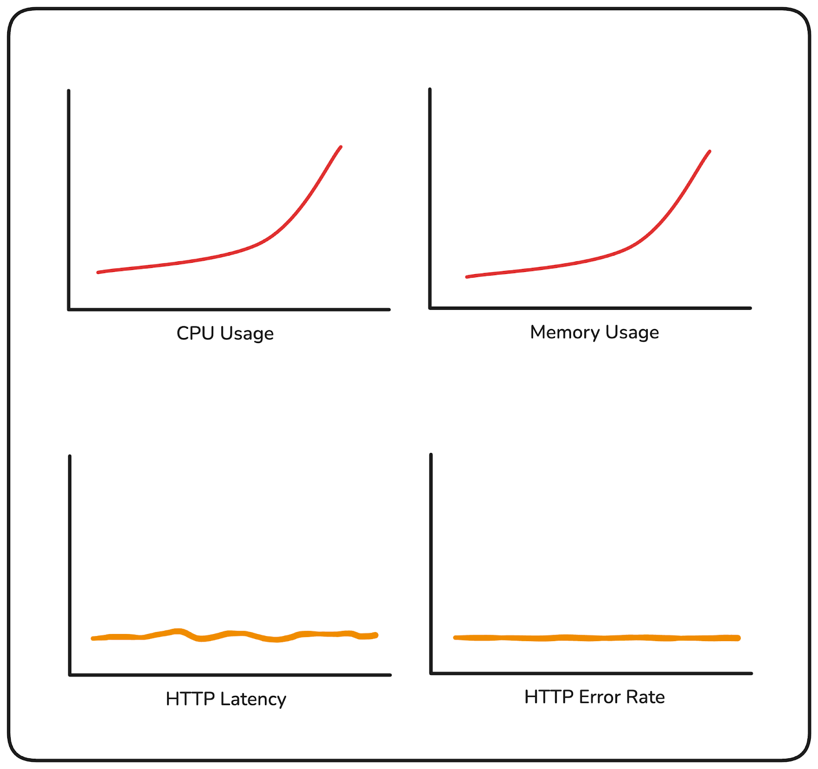
In the second scenario, your infrastructure looks completely healthy. But your error rate has been sitting at 12% for the last twenty minutes, and users placing orders are hitting failures on every third attempt. Nothing in your resource metrics flagged it.
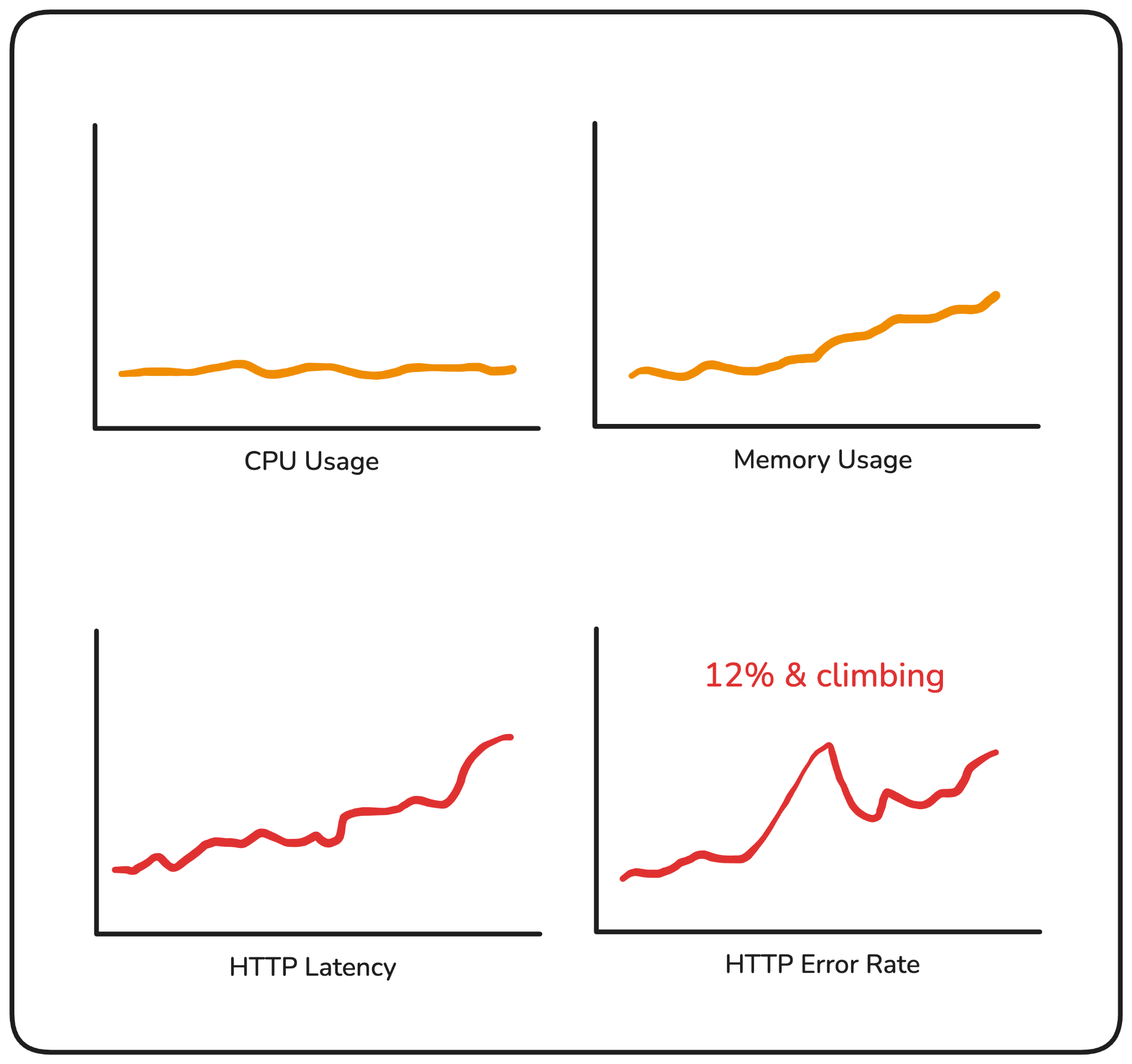
Both of these happen in production more often than they should. The first leads to unnecessary escalations. The second leads to customers finding out before you do.
Resource usage metrics are a necessary layer of visibility, but an incomplete one. They tell you your system is under pressure. RED metrics tell you whether that pressure is translating into user impact and that's a different question, one that needs different signals.
RED stands for Rate, Errors, and Duration. Three signals, each measuring a different dimension of how your service is handling requests.
Rate is how many requests your service is receiving per second.
It tells you what the load looks like at any given point in time. A sudden drop in rate usually means something upstream broke: a routing issue, a failed dependency, a deployment that took a service down. A sudden spike might indicate a retry storm or an unexpected surge in traffic. Either way, a change in rate is almost always worth investigating.
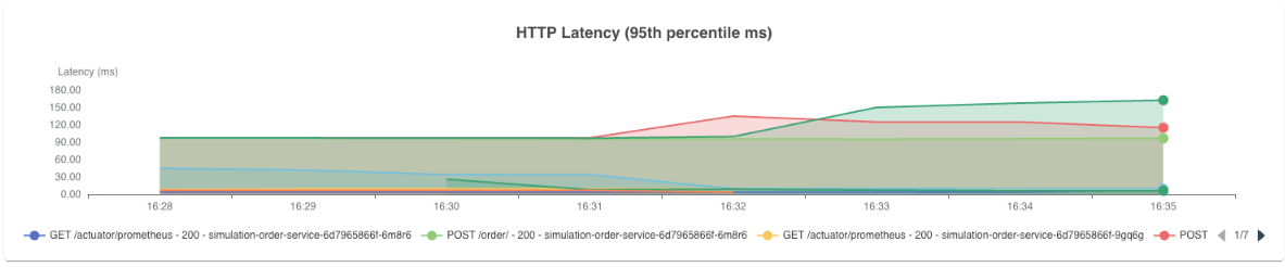
Errors is the percentage of those requests that are failing. Not raw count, “percentage”.
A 100 errors/sec means something very different at 200 requests/sec vs 10,000 requests/sec. Tracking error rate gives you a normalized view of how reliable your service is, and it's usually the first signal that something has gone wrong for your users.
Duration is how long your requests are taking to complete.
The important thing here is that you're not tracking averages. Averages hide the worst experiences. A small number of very slow requests get absorbed into an otherwise healthy-looking number, and you may never see them.
What you want is percentile-based latency. The requests sitting at the tail end of your distribution, the slowest ones your users are hitting, are what p90, p95, and p99 capture.
Tail latency rarely spikes suddenly. It tends to drift upward gradually, which is why tracking multiple percentiles together matters. If p90 starts climbing up before p99 does, that's your early warning signal.
If both are climbing together, the problem is more widespread. Each percentile tells you something different about the shape of your latency, and together they help you understand not just that something is slow, but how many users are feeling it and how severely.
If your p99 latency is 800ms in a high-traffic service, that's a meaningful number of users hitting a slow experience. Average latency would never surface it.
Together, these three signals give you a direct view into your service's health as your users experience it, not as your infrastructure reports it.
Having Rate, Errors, and Duration as concepts is one thing. Knowing what to watch for in each signal and what it's telling you when something changes, is where the real value is.
Rate works best as a baseline comparison. You're not looking for a specific number, you're looking for deviation from what's normal for that service at that time of day.
A rate drop at 2pm on a Tuesday that normally sees consistent traffic is worth investigating immediately, even if nothing else has fired yet. Rate is often the earliest signal that something is wrong upstream, before errors have had a chance to accumulate.
Error rate is where you define your tolerance. For most services, anything above 1-2% is worth an alert. Above 5% and users are feeling it.
The more useful practice is to track error rate per endpoint rather than at the service level.
A single failing endpoint can be masked by the overall service error rate if the rest of your traffic is healthy. Drilling down to the operation level tells you exactly where the problem is concentrated.
Duration requires the same granularity. A p99 latency spike on your POST /orders endpoint tells you something very specific. A p99 spike at the service level tells you something is slow, but not where.
Track latency per operation, and watch both inbound and outbound. If your inbound latency is climbing but your outbound latency to downstream services is also climbing, the problem likely isn't in your service, it's in something your service depends on. That distinction alone can cut your investigation time significantly.
This is also where the layered approach matters. You start at the operation level, roll up to the service level, and then across services if you're monitoring a full user journey. Each layer gives you a different scope of visibility, and together they let you define SLOs that reflect what your users actually experience.
Knowing what to watch for in each signal is one thing. Formalizing that into concrete commitments about how your service should perform is where SLOs come in.
A Service Level Objective is a target you define for a specific aspect of your service's behavior. Things like "99% of requests should complete in under 200ms" or "error rate should stay below 1% over a rolling 24-hour window."
RED metrics are the natural foundation for these commitments because they measure exactly what SLOs are trying to guarantee. Error rate maps directly to availability targets. Duration maps to latency commitments. Rate tells you whether your service is operating within expected load parameters.
The value of defining these thresholds upfront is that it shifts your monitoring from reactive to proactive. Instead of noticing a problem after users have felt it, you have a clear line, and when that line is crossed, you act. That's what turns RED metrics from visibility into an operational practice.
If your services are already instrumented with OpenTelemetry, you essentially already have the data. Every span your application emits carries the three pieces of information RED metrics are built from:
The only thing needed is to derive metrics from those spans.
That's what the spanmetrics connector does. It sits in your OpenTelemetry collector pipeline, reads the traces flowing through it, and automatically computes request rate, error count, and duration, without any changes to your application code.
A basic pipeline configuration with the spanmetrics connector looks like this:
connectors:
  spanmetrics:

service:
  pipelines:
    traces:
      receivers: [otlp]
      exporters: [spanmetrics]
    metrics:
      receivers: [spanmetrics]
      exporters: [prometheusremotewrite]
The connector receives trace data, derives RED metrics from your spans, and exports them to your backend of choice. For the full configuration reference, refer to the spanmetrics connector documentation.
Collecting RED metrics is one part of the problem. The other part is what you do with them once you have them.
Having a dashboard you check manually isn't a monitoring strategy. By the time you notice a spike, users are already affected. And even when you do catch something, a single metric in isolation rarely tells you the full story. A latency spike is a symptom. What caused it: a bad deployment, a downstream dependency slowing down, a memory pressure issue on a specific pod, is a different question, and answering it usually means jumping between tools.
That's the gap Randoli closes.
The first friction point most teams hit is the collection pipeline itself. Configuring the spanmetrics connector, wiring it into the collector, making sure metrics are flowing to the right backend, it's manageable, but it's setup work that has to happen before you can see anything.
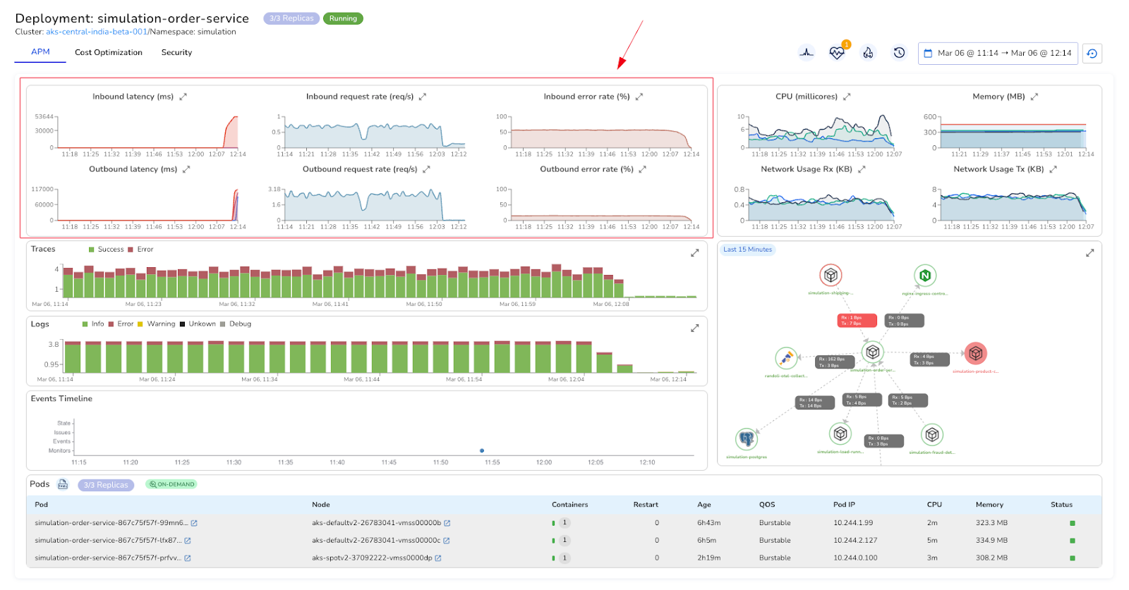
Because Randoli is OpenTelemetry-native, that pipeline is already handled. Once your services are instrumented, RED metrics appear automatically in the APM view for both inbound and outbound traffic. Beyond just deriving these metrics from spans, Randoli enriches them with additional contextual data, so what you see carries more signal than raw span metrics alone.
Inbound shows you how your service is handling incoming requests. Outbound shows you how it's interacting with its dependencies.
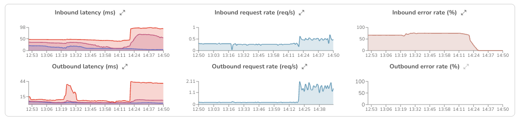
Having both directions visible matters because a latency spike doesn't always originate where it surfaces. If inbound latency is climbing because your database is slow, you need outbound signals to tell you that.
A latency spike in your RED metrics tells you something is wrong. It doesn't tell you why.
Is it a bad deployment? A pod under memory pressure? A downstream service that started degrading twenty minutes ago? Answering that question normally means opening your tracing tool, then your log explorer, then your infrastructure dashboards, mentally stitching signals together under pressure, in different tools, with different time ranges.
In Randoli's APM view, RED metrics sit alongside traces, logs, resource usage metrics, and an events timeline, all scoped to the same time window. When p95 latency spikes at the same moment a deployment event appears on the timeline and memory climbs in the resource usage metrics, you're not inferring that connection, you're seeing it directly.
That's what actually cuts investigation time. Not faster dashboards, but fewer context switches.
Even with good visibility, you can't watch dashboards continuously. If you're waiting to notice a spike manually, users may already be experiencing it.
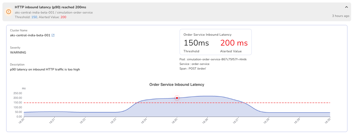
This is also where your SLOs become actionable. The thresholds you define around RED metrics: your error rate tolerance, your latency commitments, need something actively watching them and alerting when they're breached.
Writing custom alerting rules from scratch takes time to get right and still leaves gaps. What most teams need is alerting that's already tied to the signals that matter, without the setup overhead.
In Randoli, monitors for RED metric thresholds are built in and scoped directly to the service you're looking at. No PromQL required, no manual label configuration.
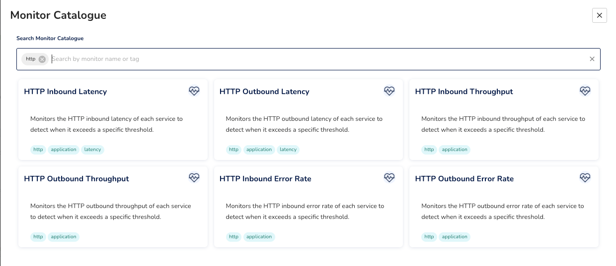
When something breaches, the alert surfaces in context, on the same events timeline you're already using to investigate, alongside the signals that triggered it.
The goal isn't more alerts. It's knowing before your users do.
Infrastructure metrics will always have a place in your monitoring stack. But they answer a different question than the one that matters most during an incident: are my users being impacted right now?
RED metrics answer that directly. They're the layer that tells you what your infrastructure metrics can't.
The shift worth making isn't just collecting these telemetry. It's making sure they're connected to the rest of your signals, monitored against thresholds that reflect your actual SLOs, and surfaced with enough context that when something fires at 2am, the investigation starts from a clear picture rather than a blank dashboard.
.png)
.png)